Whether you own a café, restaurant, retail store or office, keeping on trend with the latest colours is a great way to engage your customers.
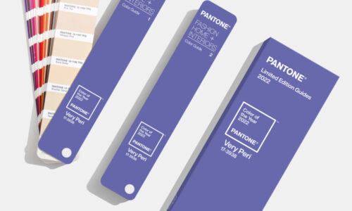
As one of the leading Interior Projects Specialists in Sydney, we are always searching for new ways to add a little zhuzh to our client’s refurbishment, so we were happy to note Pantone’s new colour of the year is Classic Blue (19-4052).

How can you use Pantone’s Classic Blue for your refurbishment?
Pantone describes their Classic Blue as instilling calm, confidence and connection for the new decade, as well as a timeless simplicity. Peace, tranquillity and sanctuary are other words that describe this fabulous hue. It can be used in bold swathes or as a highlight to other colours.
One of the easiest ways to include Classic Blue into your Sydney refits is in items that can be removed or replaced easily. This means that you can update your colours every year, keeping your business on trend at all times!
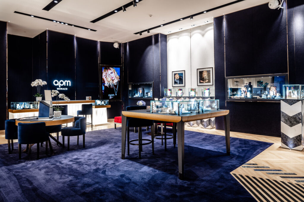
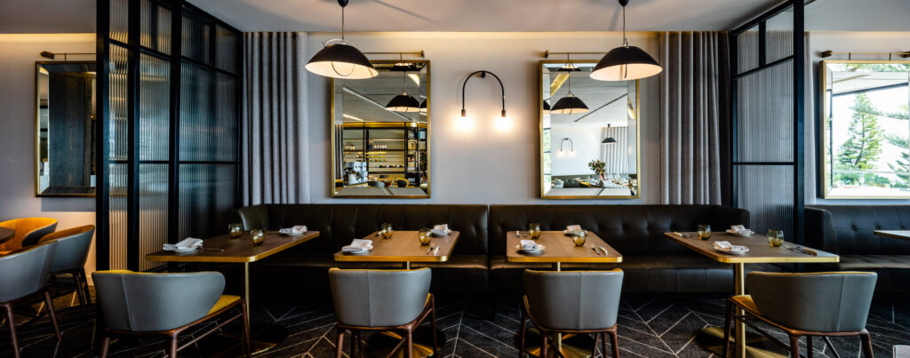
For café fitouts, you might reupholster your casual seating (comfy arm chairs and lounges) in Classic Blue, whilst restaurants might reupholster their dining chairs for example.
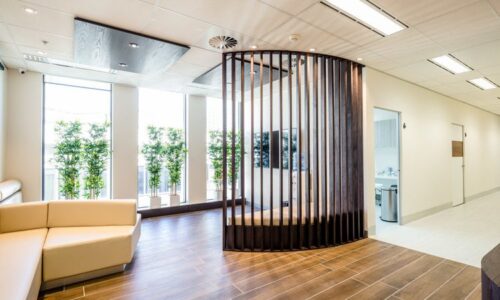
Retail stores can repaint their walls in Classic Blue and offices can add promotional art or comfortable seating in the foyer.
Classic Blue is truly a classic, because it fits in well with most colour palettes. However, as it’s such a dark colour, it needs to be balanced within a space, otherwise it can become overpowering.
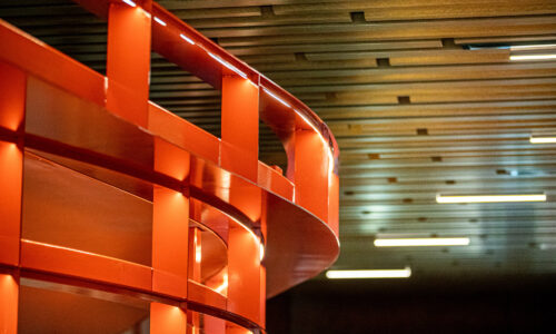
Colours that mix well with Classic Blue are crisp whites, terracottas, citrus shades (oranges, limes and lemons) and neutrals.
Blues of any hue are generally seen as relaxing, so they are fine for café fitouts, restaurant refurbishments, retail fitouts and office refurbishments.
Colours that mix well with Classic Blue are crisp whites, terracottas & citrus shades.
For cafes and restaurants however, it’s best not to allow dark blue to become the main colour or it can be off-putting in these environments.
