As interior projects specialists and experts in new office fitouts, one of our main jobs is to select the right colour schemes for our clients.
We usually suggest that it is best to stay away from trendy colours, because they come and go so quickly; what is in vogue this year, might be really old hat next year! That is unless you are happy to pay for new office refurbishments every year or more importantly, they are your branding colours.

Colours you should avoid in office fitouts
Below are 7 colours that you should avoid in office refurbishments, but mainly when they are used as block colours. You can use them as accent colours sparingly of course, but it is never a good interior design idea to paint your office walls lime green or bright pink.
- White: This is too stark and clinical and doesn’t do much for promoting productivity, particularly with overhead fluorescent lighting. Too much brilliant white can be overwhelming in office fitouts, making people feel isolated, detached and disinterested.
- Dark grey: This colour lacks energy and tends to supress our creativity, fostering a lack of confidence, sleepiness and even depression. If you really want to use dark grey in your office refurbishments, use it sparingly on accessories and furnishings, adding in other colours for a more upbeat contrast.
- Yellow: Even though yellow can be uplifting, making us feel warm and happy, too much yellow in your interior design can have the opposite effect. As interior projects specialists we know that too much bright yellow can evoke anger, irritation and frustration, in much the same as too much red.
- Red: For stimulation, a racing pulse, and an eye for detail, you can’t go past fire engine red. However, if you really want to avoid unrest and arguments in the office, it’s best to steer away from too much of this colour and just use pops of it around the office instead.
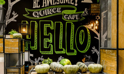
- Lime green: Another exciting and trendy colour, lime is ideal for creative environments as it bounces energy around the room. The problem for office refurbishments however, is that it can be too distracting, reducing productivity and efficiency. On the other hand, as an accessory colour it is energetic and is perfect for creative office spaces.
- Purple: Most people either love or hate the colour purple, but it has been known for its romantic connotations for many years. For a creative and efficient office space, you should avoid lots of purple in your interior design, as it has the potential to increase romantic feelings, causing distractions and lowering productivity.
- Bright pink: This is another distracting colour that reduces focus and concentration in the work environment. It is also too extremely feminine, causing men to be even more distracted than women.

Colours to embrace in office fitouts
If we have to avoid all of these colours in our office refurbishments – what’s left? Well, for block wall colours you can’t go past light greys, tonal whites and pastels. So think about light blues for subtle energy and creativity, peaches for freshness and comfort, and light greys (which are trendy right now) for security, reliability and experience. Just add pops of colour from the ‘7 colours to avoid’ and you will have the perfect office makeover.