Very Peri is Pantone’s colour of the year 2022. It is a unique shade of purple that encourages creativity and imagination. The colour belongs to the blue family, containing a violet red undertone.
Pantone’s executive stated that the colour is meant to enhance creativity and show off a lively attitude.
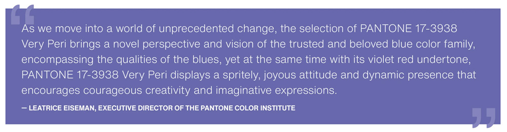
“The Pantone Color of the Year reflects what is taking place in our global culture, expressing what people are looking for that colour can hope to answer,” Laurie Pressman, vice president of the Pantone Color Institute, said in a press release.
_____________________________________________________
Very Peri, Pantone’s colour of the year 2022, is a unique shade of purple that encourages creativity and imagination.
_____________________________________________________

Why Very Peri?
We are living in transformative times.
Very Peri is a symbol of these times and the transition we are going through. We are coming out of a period of isolation due to Covid, and our ideas and standards are changing. The digital aspect of our lives has also changed and we are stretching the limits of reality, opening the door to a dynamic virtual world where we can explore and create new colour possibilities. With trends in gaming, the expanding popularity of the metaverse and the rise of the digital space, PANTONE 17-3938 Very Peri illustrates how colour in the digital world and the physical world can fuse.
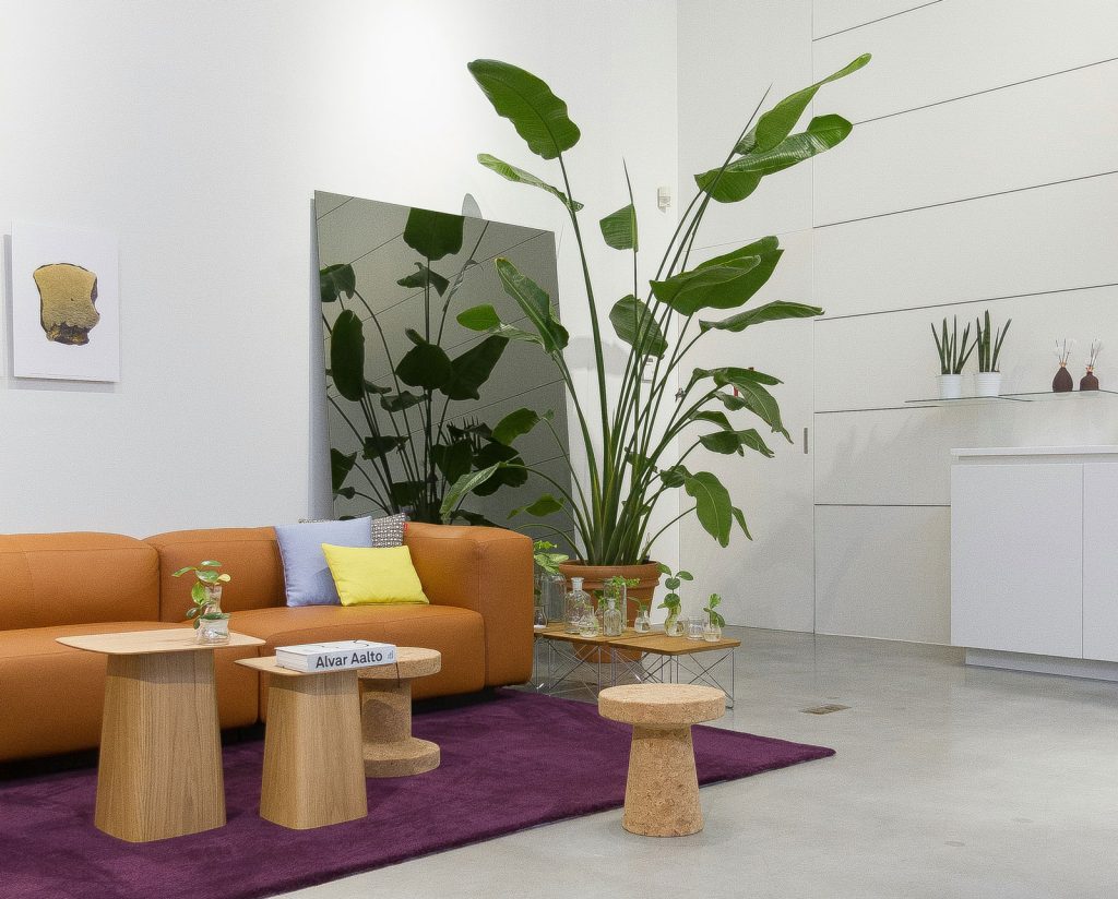
Interior design examples
Very Peri has great potential so don’t be afraid to experiment with this bold and fun colour. Use this colour to infuse a fresh, dynamic and joyous vibe into your interiors.
Check out how is it used in Cafe Krujok. Together, architect Eduard Eremchuk and designer Katy Pititskaya, have designed an “unusual, slightly crazy and unreal” pastry cafe.
Another example is a hamburger cafe in Italy called Bun Milan – creating a sophisticated but fun interior.
Tips on how to use Very Peri
This colour is very versatile – making it easy to combine with both warm and cool tones.
- Match with the right colours: This carefree colour pairs well with white, pink, beige, green. Also, it offers great value when paired with orange and yellow.
- Use it as an accent wall: Break away from neutral walls and introduce Very Peri as an accent wall.
- Use it a a pop of colour: Or if a whole wall is too much, use Very Peri as a pop of colour, an artwork, a chair or even a vase!